The Four Power Points
Two vertical and two horizontal lines make four intersections. A subject placed on any of them reads as intentional and leaves the rest of the frame open for context, a headline, or a call to action.
Off center, on purpose.
Divide the frame into three columns and three rows, and put what matters on the lines and their four crossings. The oldest composition rule in photography works just as well for hero images, crops, and the first screen of a page.
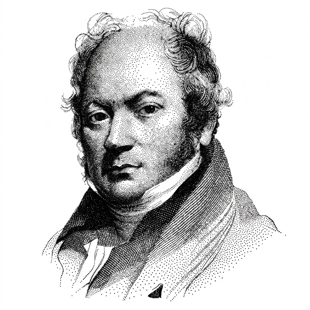
John Thomas Smith, an English painter and engraver, coined the term in Remarks on Rural Scenery (1797), arguing that a picture should be divided by thirds — about two-thirds land to one-third sky — rather than in half. Photographers turned the proportion into the familiar three-by-three grid in the twentieth century, and cameras have drawn it on the viewfinder ever since.
Eye-tracking gives it some support: viewers linger on off-center subjects and read empty space as room to move into. Its real value is as a starting point that avoids the static dead center, not as a law. Symmetry, the Gutenberg diagram, and the golden ratio each win in their own situations.
Place the focal element on one of the four intersections of a three-by-three grid, and horizons or dividing edges on a third line. The composition gains direction and tension that a centered layout lacks.
Two vertical and two horizontal lines make four intersections. A subject placed on any of them reads as intentional and leaves the rest of the frame open for context, a headline, or a call to action.
Put the headline block in the left third and the product image across the right two-thirds, or the reverse. The split gives the eye a place to land and a place to go, which a centered stack does not.
When a photo is cropped automatically for a card or a list, keep the subject on a third line rather than centered. Focal-point cropping does this by storing one x and y point per image and cutting around it at every size.
Horizons, table edges, and split panes sit better on a third line than in the middle. Two-thirds content to one-third sidebar is the same instinct Smith described for land and sky.
An off-center subject leaves negative space in the direction it faces or moves. That space is not waste; it carries the message the subject points at — a headline, a caption, a call to action.
On a dashboard, the number people came for belongs near a top crossing, not in the middle of a uniform grid. The thirds give one tile permission to lead while the rest stay peers.
Symmetry has its own authority: logos, dialogs, empty states, and single-claim pages often read best centered. Break the rule when balance, not tension, is the goal.
The rule of thirds puts the subject at 33 percent, the golden ratio at 38, and the Gutenberg diagram sends the eye diagonally through both. They agree more than they differ: away from the center, along the reading path.
Generated and auto-cropped imagery needs a rule it can be measured against; the thirds are the simplest one.
Vision models can find the subject and place it on a third for every crop size a card system needs. Set the crop rule once, then audit the outliers: faces near an edge, text cut off, a subject that drifted to the center.
Image generators default to centered subjects. Asking for a subject on the left third with open space to the right produces hero images that fit a layout instead of fighting it.