The effect
01 / 10
Neighbours Set the Scale
The same circle looks smaller among large circles and larger among small ones. Nothing about the circle changes; only the reference the eye measures it against.
A size is judged by the company it keeps.
Two identical circles look different sizes when one is ringed by large circles and the other by small ones. Every size on a screen is read against its surroundings, so a button, an icon, or a bubble in a chart can look bigger or smaller than it is.
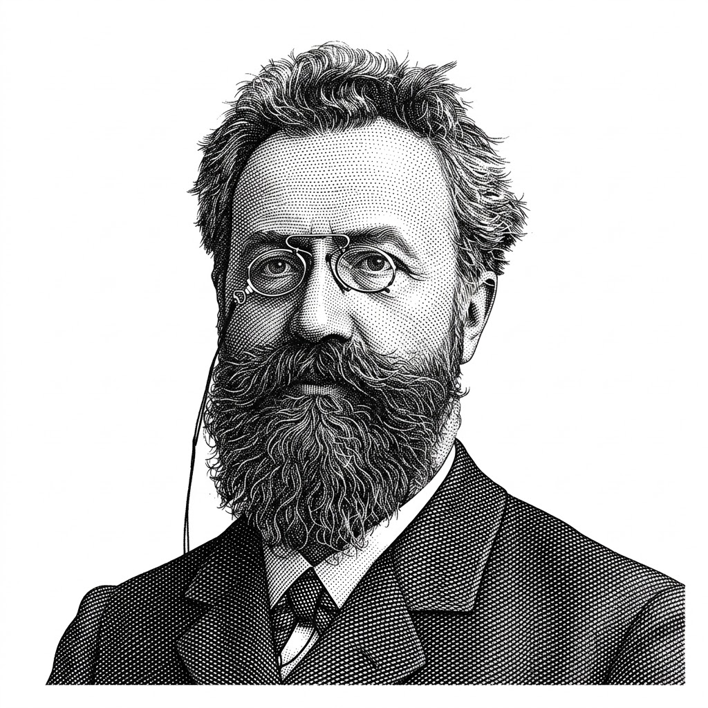
The illusion is named for Hermann Ebbinghaus, the German psychologist better known for his experiments on memory and forgetting. Edward B. Titchener brought it to English-speaking readers in a 1901 textbook of experimental psychology, which is why it is also called Titchener circles.
Size is only part of the effect. A 2005 study showed that distance matters too: surrounding circles placed close to the centre make it look larger, and distant ones make it look smaller. Because large circles cannot sit as close as small ones, many earlier studies had mixed the two causes together.
The eye judges a shape’s size against its neighbours rather than measuring it on its own. Surround a circle with larger circles and it looks smaller; surround it with smaller ones and it looks larger. How close those neighbours sit changes the effect as well.
The same circle looks smaller among large circles and larger among small ones. Nothing about the circle changes; only the reference the eye measures it against.
Surrounding circles placed close to the centre make it look larger, and distant ones make it look smaller. Spacing is part of the illusion, not just the size of the neighbours.
A primary button beside a large image or headline reads as smaller than it is, while the same button in a sparse toolbar reads as large. Judge its size where it will live.
An icon beside larger icons looks undersized, and the same icon among smaller ones looks heavy. Consistent optical size has to be checked in context, not only in the icon grid.
In bubble charts, maps, and treemaps, a mark ringed by larger marks reads as smaller than one ringed by smaller marks. Area is already hard to judge, and the illusion makes it worse.
When sizes must be compared accurately, take the surroundings out of the judgment: align the items, give them a common baseline, or print the number beside each one.
University students were deceived more often than children aged ten and under, who are less sensitive to context. Reading size through its surroundings appears to develop with age.
In a study by Melvyn Goodale, people grasping the centre disk opened their grip to its real size, not its apparent size; other work found the hand fooled as well. The debate fed the theory of separate visual pathways for perception and action.
Layouts and charts can now be generated faster than anyone reviews them in context, so sizes that look right in isolation reach people unchecked.
A model can produce a bubble chart or treemap in seconds, with areas that are mathematically correct and perceptually misleading. Review area encodings the way a reader will see them.
Automated design checks measure pixels, not perceived size, so they pass elements that people will read as unequal. Pair them with a look at the layout in context.