Gutenberg Principle

From top-left to bottom-right.

On evenly weighted pages the eye sweeps from top-left to bottom-right. The Gutenberg principle maps that reading gravity — and where to put what matters.

Origin

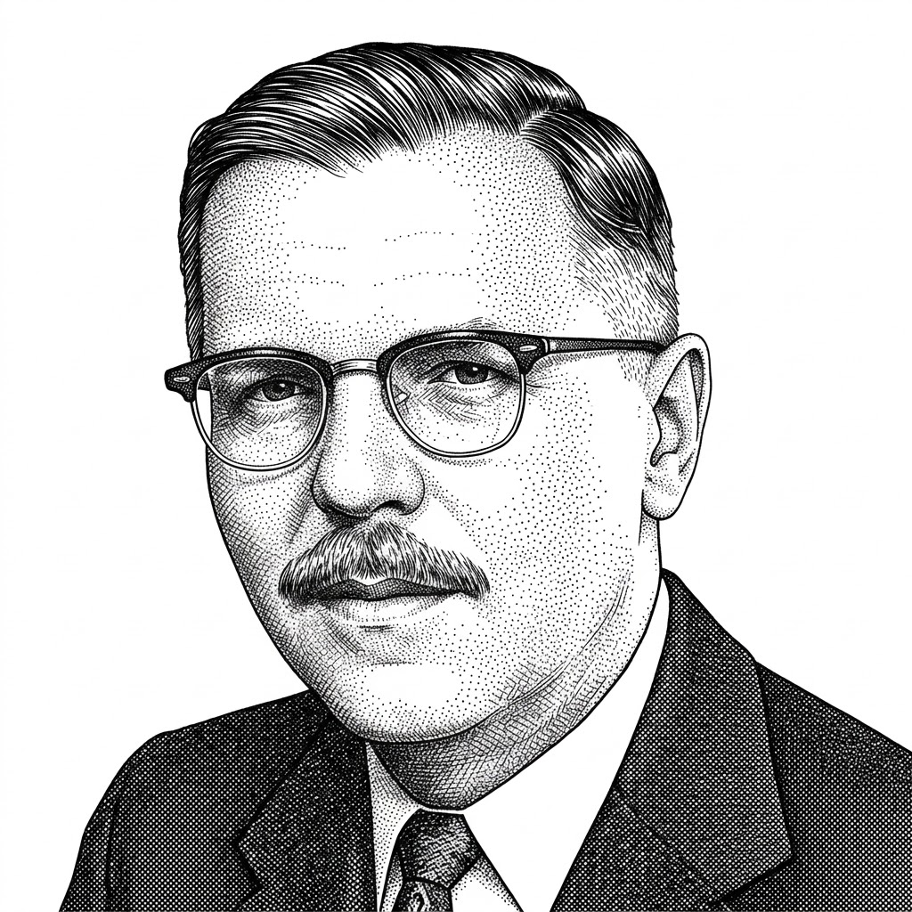
Edmund C. Arnold was an American newspaper designer and journalism professor, often called the father of modern newspaper design. Over a career spanning Syracuse and Virginia Commonwealth universities he redesigned hundreds of papers and wrote more than two dozen books on publication layout.

The diagram is named for Johannes Gutenberg only by association with print; it was Arnold who described reading gravity — the habitual top-left to bottom-right sweep trained by Western text — and turned it into a practical layout tool.

The Principle

On evenly weighted pages, the eye sweeps from the primary optical area at top-left to the terminal area at bottom-right, giving the two fallow corners far less attention. Put openings top-left and calls to action bottom-right.

Coined by
Source
Newspaper layout practice and teaching
In practice
CTA bottom-right, brand top-left
Quadrant 1 02 / 10

Primary Optical Area

The top-left quadrant — where the eye lands first when no other visual cue grabs it. In Western reading cultures, this is where headlines, logos, and identifying brand marks belong by default.

Place here
Logo · Headline · Brand
Why
First place the eye looks
Watch for
RTL languages flip this
Quadrant 2 03 / 10

Strong Fallow Area

The top-right quadrant receives meaningful but reduced attention. Content here is glanced at, not read. A common spot for navigation, search, or supporting hero imagery.

Place here
Nav · Secondary actions · Image
Reads as
Glance, not focus
Watch for
Hiding critical content here
Quadrant 3 04 / 10

Weak Fallow Area

The bottom-left quadrant gets the least attention of all four. The eye sweeps past it on the way down and to the right — for many users, content placed here may as well not exist.

Avoid here
CTAs · Key headlines · Pricing
OK here
Footer · Boilerplate · Legal
Watch for
Anything users must see
Quadrant 4 05 / 10

Terminal Area

The bottom-right quadrant is where the eye rests after sweeping across the page. It’s the natural place for a call to action — the eye literally ends up here, ready for the next step.

Place here
Primary CTA · Sign-up · Buy
Why
Natural endpoint of the sweep
Watch for
Burying CTA somewhere else
Gravity 06 / 10

Reading Gravity

The diagonal pull from Primary to Terminal. Reading gravity is the default — what happens when no other visual hierarchy interrupts the sweep. Reinforce it with content that supports the journey.

Direction
Top-left → bottom-right
Reinforce with
Aligned content along the line
Watch for
Competing diagonals
Axis 07 / 10

Axis of Orientation

The perpendicular line, from top-right to bottom-left, is the axis the eye actively resists. Crossing it costs effort — which is why content placed in the fallow corners gets so little attention.

Direction
Top-right → bottom-left
Effect
Eye resists this crossing
Use case
Hide secondary info on this line
Applies 08 / 10

When It Applies

The Gutenberg Principle describes a default reading pattern — what happens with evenly distributed, visually homogeneous content. Newspaper-style layouts, prose-heavy pages, dense documents.

Best for
Print · Long prose · Documents
Condition
Homogeneous content
Cultural
Western LTR reading
Override 09 / 10

When It Doesn’t

Any strong visual element overrides reading gravity. F-pattern or Z-pattern emerge in their place. Most modern web pages — with images, buttons, and varied type — break Gutenberg entirely.

Breaks when
Images · CTAs · Type contrast
Replaced by
F-pattern · Z-pattern · spotted
Verdict
Rare in modern UI
Layout 10 / 10

Practical Applications

Where the diagram still applies: editorial layouts, newsletters, dense article pages, terms of service, and any composition that needs to feel formal and traditional. Put the byline top-left, the CTA bottom-right, and let gravity do the rest.

Best for
Editorial · Newsletters · Print
Logo
Top-left (Primary)
CTA
Bottom-right (Terminal)

Gutenberg in the Age of AI

A conversation has no quadrants — when the answer is returned directly, the four-zone reading model gives way to a single vertical stream.

✦ AI Era

Chat Has No Quadrants

A conversation is a single vertical column with no Primary or Terminal zones. Reading gravity flattens into a simple top-to-bottom stream of turns.

Shift
Quadrants → stream
Use when
Linear conversation UI
Watch for
Losing the CTA position
✦ AI Era

The Answer Replaces the Layout

When AI returns the answer directly, there’s often no page to lay out at all. The four-quadrant diagram gives way to a single, generated response block.

Shift
Layout → answer
Use when
Direct-answer interfaces
Watch for
No room to scan or compare
Further Reading

Interaction Design Foundation