Grouping
01 / 10
Proximity
Objects close together are perceived as belonging to the same group. The single fastest way to communicate relationships — without any borders, dividers, or labels.
How the Mind Groups What it Sees
The mind automatically groups what it sees. These ten principles of perception explain how people read structure into a layout before they read a single word.
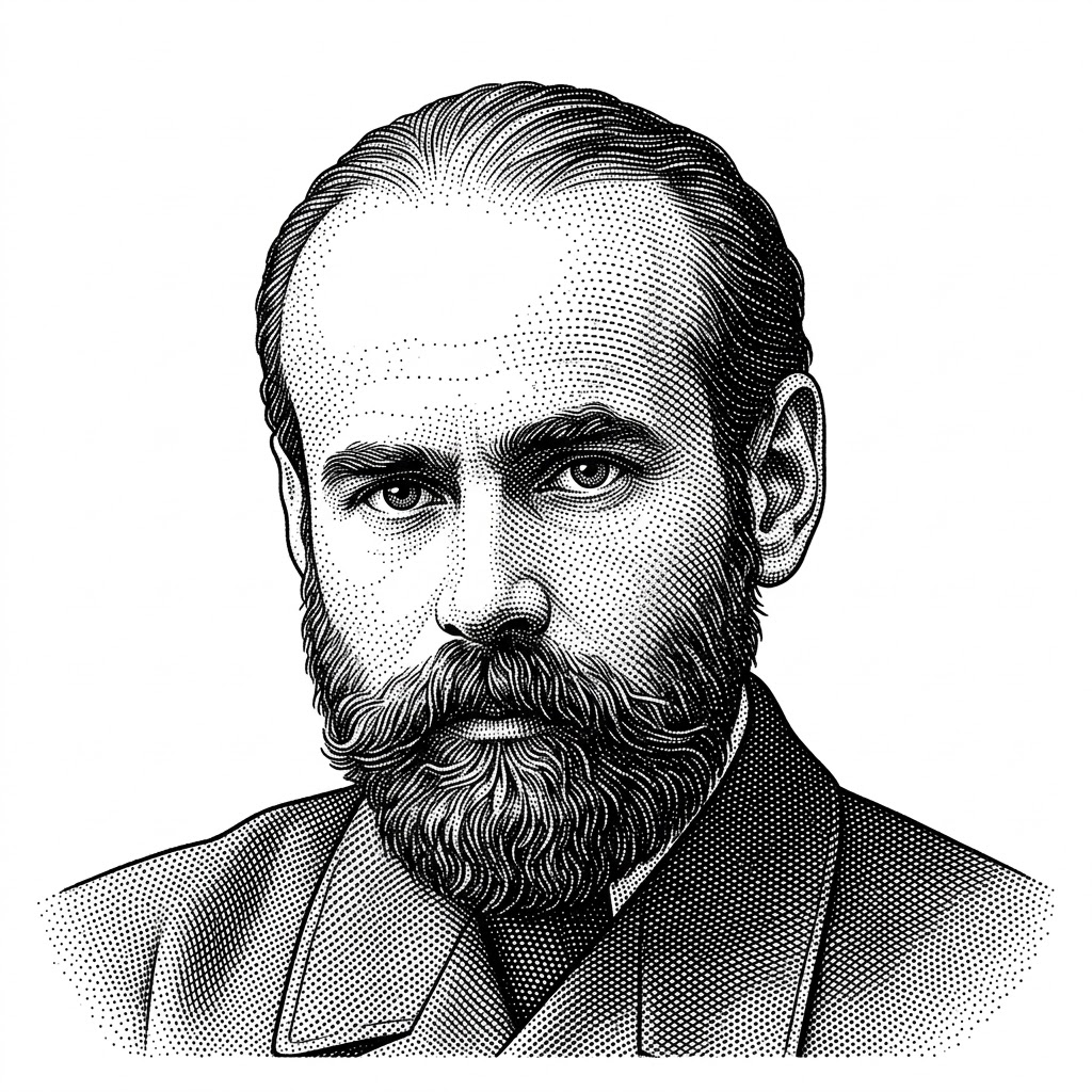
Gestalt psychology began in 1912 with Max Wertheimer’s studies of apparent motion, developed alongside Kurt Koffka and Wolfgang Köhler, first in Frankfurt and later in Berlin. Their maxim — the whole is other than the sum of its parts — reframed perception as an active organizing process rather than passive reception.
Koffka left Germany in 1924 and settled at Smith College in 1927; Wertheimer and Köhler followed as the Nazis rose, seeding gestalt thinking into American psychology. Interface design adopted their grouping principles wholesale: proximity, similarity, closure, and continuity are now the grammar of layout.
The mind groups what it sees before reading a single word — by nearness, likeness, connectedness, and closure. A layout that works with these instincts communicates structure for free; one that fights them needs borders and labels everywhere.
Objects close together are perceived as belonging to the same group. The single fastest way to communicate relationships — without any borders, dividers, or labels.
Items that share appearance — shape, color, size — are perceived as related. Style links objects without forcing them to live next to each other in space.
The eye follows smooth, continuous paths. Two crossing lines are perceived as two flowing curves rather than four disconnected segments — guiding the eye along the intended trajectory.
The mind completes incomplete shapes. A few well-placed strokes can imply a circle, triangle, or letter — using less ink and making the viewer’s brain do the satisfying work.
The mind separates an object (figure) from its background (ground). Strong contrast makes the figure obvious; ambiguous contrast lets the same image flip between two readings.
Elements that move together are perceived as a group. Animation, even subtle, ties objects into a unit — the principle behind synchronized list reveals and staggered loaders.
Symmetrical pairs are perceived as belonging together — even when separated. Mirrored composition feels stable, balanced, and resolved without further explanation.
Items inside the same enclosed area are perceived as a group — even if they’re farther apart than items outside it. A simple border or background panel overrides proximity entirely.
Items joined by a line, stroke, or shape are perceived as related — and this link is stronger than proximity, similarity, or common region. A wire turns separate nodes into a graph.
The unifying meta-principle behind every other Gestalt rule: when the mind has a choice, it picks the simplest interpretation. Five overlapping rings read as the Olympic logo, not as a tangle of arcs. Design with this bias in mind and the interface will resolve into the cleanest possible mental model — fight it and the design will feel busy no matter how organized it actually is.
Machines now group content too — but whether a human sees structure or noise still comes down to the same laws of perception.
Embedding-based grouping mirrors proximity and similarity — the model clusters related items much the way perception does, automating what designers once did by hand.
However an AI arranges a screen, the laws of grouping decide whether a person reads structure or chaos. Gestalt is the human check on generated layouts.