Von Restorff Effect

The one that differs is the one remembered.

Hedwig von Restorff showed in 1933 that when one item in a group differs from the rest, it’s the one people remember. The isolation effect is why a single accent color works — and why ten of them don’t.

Origin

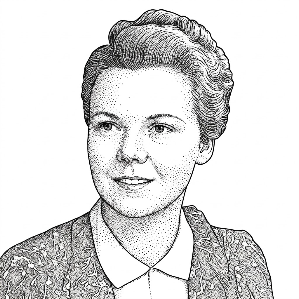
Hedwig von Restorff was a German psychiatrist and pediatrician working in the Gestalt tradition at the University of Berlin. Her 1933 experiments showed that an item that stands out from its neighbors — in color, size, or kind — is dramatically better remembered.

The finding became known as the isolation effect. Her academic career was cut short when the Gestalt school around her was dismantled in 1930s Germany, but the effect she documented became one of the most-used levers in advertising and interface design.

The Effect

When multiple similar items are presented together, the one that differs from the rest is most likely to be noticed and remembered. Distinctiveness is a budget: the fewer things that differ, the more powerfully each difference works.

Coined by
Source
Isolation-effect experiments, Berlin
In practice
One emphasis at a time
The effect 01 / 08

The Isolation Effect

Nine grey squares and one blue one: nobody forgets which was blue. Difference against a uniform field is the strongest attention signal a layout can send — stronger than size, position, or repetition.

Signal
Difference from the field
Strength
Beats size and position
Requires
A uniform background
Budget 02 / 08

One Accent Only

The effect spends a budget. One highlighted element per screen is unforgettable; three compete; ten cancel out and the screen reads as noise. Every emphasis you add taxes every emphasis already there.

Rule
One per screen
Two+
They compete
Everything
Nothing stands out
CTAs 03 / 08

Primary Actions Earn the Color

This is the theory beneath the primary button. One filled, colored action against quiet neighbors gets found, chosen, and remembered. Secondary actions stay grey precisely so the primary one can differ.

Primary
The one that differs
Secondary
Deliberately quiet
Watch for
Two primaries
Misuse 04 / 08

Don’t Isolate the Wrong Thing

The effect works on whatever differs — including a promo banner, a decorative badge, or an ad. If the most distinctive element on the screen isn’t the most important one, you’ve aimed the isolation effect at your own foot.

Ask
What differs most?
Answer should be
What matters most
Common miss
Promos out-shout actions
Access 05 / 08

Never Color Alone

For color-blind and low-vision users, an isolation built purely on hue disappears. Pair the color difference with a second channel — weight, an icon, a fill, position — so the distinct item stays distinct for everyone.

Rule
Two channels minimum
Pair color with
Shape · weight · icon
Standard
WCAG 1.4.1
Commerce 06 / 08

The Highlighted Plan

Pricing tables run on von Restorff: the recommended tier gets the border, the badge, and the tint, and it converts far beyond its share. Isolate the plan you’d honestly recommend — users notice when the emphasis is cynical.

Pattern
One featured tier
Effect
Outsized selection
Keep it
Honest

Von Restorff in the Age of AI

When every product marks its AI features with the same sparkle, nothing is isolated any more — and machine-chosen emphasis raises who decides what stands out.

In the Age of AI 07 / 08

The Sparkle Stopped Sparkling

When AI arrived, the ✦ sparkle was isolated — one glowing feature in a familiar UI. Now every toolbar has one. A distinctiveness signal adopted by everyone is a distinctiveness signal for no one.

Lesson
Shared signals fade
Counter
Differ in behavior, not badge
In the Age of AI 08 / 08

Machine-Chosen Emphasis

Models can now decide which item to highlight — per user, per moment. That puts the isolation effect on autopilot: powerful when the model highlights what the user needs, corrosive when it highlights what the business wants clicked.

Upside
Right thing, right time
Risk
Dark-pattern autopilot
Further Reading